Oysters! We have them, in SF Bay!
—by Naomi Schiff : October 3, 2014
Our friends at the Coastal Conservancy have published a new guide on oyster restoration. They have been experimenting with ways to encourage the native oysters to settle in larger numbers, both in SF Bay and at Elkhorn Slough. We updated the website lately, in case you are interested in taking a look: http://www.sfbaysubtidal.org/oysters_and_climate-about.html
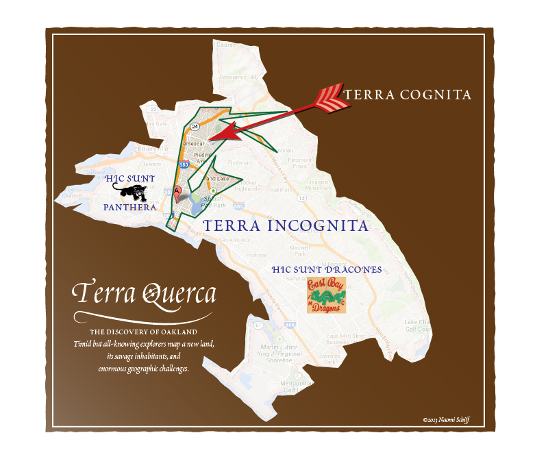
OAKLAND: it is bigger and more interesting than National Geographic and the NY Times think!
—by Naomi Schiff : July 11, 2014
Although Oakland is getting some good press, it is the same tiny part of it that gets all the attention. Okay, yes, we know about Rockridge, Temescal, downtown, uptown, Jack London Square, and Lake Merritt. And we've heard about the fabulous regional parks. But all that is a tiny slice of Oakland!
Now! Guided Tour Offer! We hereby offer to any reporter, travel writer, or columnist, an educational tour of other sites of cultural activity, natural beauty, extraordinary cultural riches, fascinating architecture, local history, artistic endeavor, and our diverse and friendly population. In exchange, we just hope you will go beyond the tiny area that your many colleagues already wrote about!
Here's a map that comments on the problem:
17th Street goes under the bay!
—by Naomi Schiff : February 2, 2011, 3:31pm
We really enjoyed putting together a new website at www.sfbaysubtidal.org with Marilyn Latta's team at the Coastal Conservancy and their partner agencies. Great photos by Lorenzo+Avelar who did a fine job of integrating above- and below-water views of the bay. Our web advisor Tod Abbott helped us with the technical fine points and with implementing a portal for the excellent map by Stillwater Sciences, showing some of the interrelated factors affecting the bay. The project was described in a Contra Costa Times article. To celebrate the website's launch we all went to Hog Island Oysters, to drink beer and eat oysters by the bay; you'll see why if you read the article.
50 Jobs in 50 States in 50 Weeks
—by Randall Goodall : February 2, 2011, 11:50am
Speaking of Berrett-Koehler Publishers (see below) we just shipped a B-K book that was fun to work on: Daniel Seddiqui's 50 Jobs in 50 States. You might remember hearing about Daniel in the news; he's the young man who, just out of college and looking for something to do, went to every state in the union and took a different job in each place, trying to get a job that was representative of each state. Lobster fishing in Maine, surfing instructor in Hawaii, and so forth. Well, he wrote a book about his year, took a LOT of pictures, and Berrett-Koehler wanted to include a hundred or so of his photos. Photo books are right up our alley, so they offered us the job and we were happy to do it.
But I had a few misgivings at first because I remembered Daniel's story had been used by some commentators as evidence that there was no serious shortage of jobs in this recession and anyone who really looked for work could get it. I wondered if the book would have an agenda that I'd find a little unpleasant. I needn't have worried. Daniel Seddiqui is a very nice guy who thought the year after college was a good time to have an adventure and also genuinely wanted to see what kind of work he liked (plus a healthy dose of wanting to prove something to his folks and a certain girl). The book is fun to read and made me think maybe all recent grads should try this. Berrett-Koehler published it as a black/white book and a color eEdition, and Daniel has his own web site with hundreds of his photos.
Thank you, Bookbuilders West (and Berrett-Koehler)
—by Randall Goodall : February 1, 2011, 11:14am
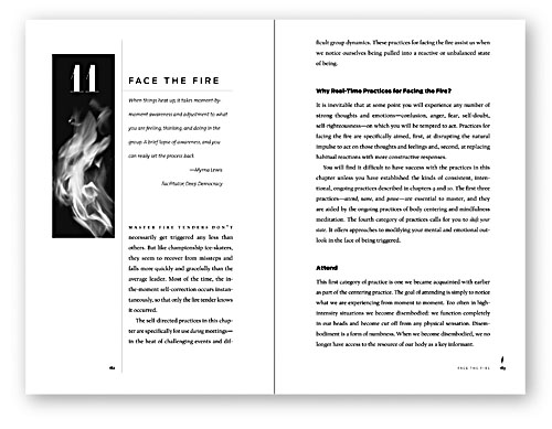
Naomi and I had fun at last week's Bookbuilders West Book Show. Always nice to see everyone and all the pretty books they entered in the Show. Our old friends Wilsted & Taylor had some real beauties on display and Getty Publications should just sit down and take a break; they're making the rest of us look bad. We had a handsome Earth Science textbook for Pearson that should have won something and didn't, but we were more than pleased with the two awards for Berrett-Koehler books: Devora Zack's Networking for People Who Hate Networking and Larry Dressler's very interesting book Standing in the Fire, about facilitating meetings between polarized and angry groups.
These are business trade books and not usually the kind of book that stands out for its design, but Berrett-Koehler Publishers has production standards more like a university press (Rick Wilson, their VP for Design and Production, came from MIT Press), and we make their titles look as good as we know how. Glad that someone noticed! Thank you, Bookbuilders. Looking forward to next year, when we'll enter the Crocker Art Museum catalog (see below).
The New Crocker Art Museum
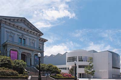
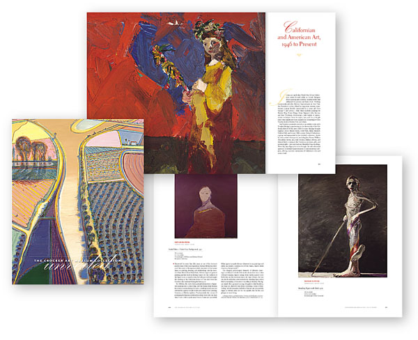
—by Randall Goodall : January 5, 2011, 3:34pm
The fun and historic Crocker Art Museum in Sacramento has built a new, modern wing, attached to the original 1873 building, the Crocker family mansion. To celebrate, they published the first catalog of their complete collection, The Crocker Art Museum Collection Unveiled, and asked us to design and produce it. I have to say, it turned out to be really beautiful. It's a pleasure to work so hard on something so large (540 pages of heavy coated paper) and have it turn out so well. We're very grateful to everyone at the museum, especially Associate Director and Chief Curator Scott A. Shields. Curator Diana Daniels was great too, and Jesse Bravo, who photographed the collection. Go see the new museum! It's really an interesting collection.
Poems of my youth resurface on the internet
—by Randall Goodall : December 23, 2010, 3:45pm
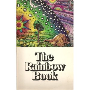
My first real book job, something actually published and not just printed on my own press, was in 1975: The Rainbow Book, edited by F. Lanier Graham, and published by the Fine Arts Museums of San Francisco for The Rainbow Show, a very eclectic exhibit organized around artistic representations of spectra. I was a pasteup artist, if you know what that was; a vanished occupation. The production process was loose, the design almost collage-like, and I discovered that if we had a little empty space, I could pop in a poem or a drawing and no one minded. I thought all publishing projects worked like that! Anyway, I've discovered via Google that a poet named Rosebud Penfold, in her poetry blog, has posted one of my poems from that book. She must have one of the last remaining copies of The Rainbow Book. Thank you, Ms Penfold; it was a thrill to see it after all these years.
More fine art on science covers
—by Randall Goodall : October 18, 2010, 3:30pm
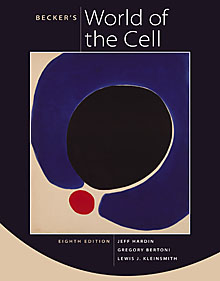
Well, it's nice to be busy and we're very glad we've had a good year, but we sure haven't blogged much recently. Anyway, we just shipped a new example of the current trend of using abstract paintings on science textbook covers (see below). It's the new edition of the Benjamin-Cummings title Becker's World of the Cell, using a really great Olitski painting we found that looks quite cell-like. This series has a tradition of always having a red dot on the cover; no one seems to remember why.
Bookbuilders West Book Show
—by Randall Goodall : February 4, 2010, 3:30pm
Bookbuilders West had their book show last week (I guess "our book show" since we're members) and instead of being the usual big fancy awards dinner with speakers and musical acts and tablecloths and such, it was a very stripped-down event with pizza and beer and no tables and no big presentation, a casualty of the recession. Guess what: best show ever! Lots of time to hang out with friends. Good pizza. Everyone loved it. Nice work, Bookbuilders. And thanks for the nice award for our design for the physics textbook, Wilson/Buffa/Lou, College Physics, 7e, for Addison-Wesley.
Fine art covers on science textbooks
—by Randall Goodall : December 2, 2009, 2:54pm
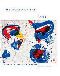
There's a funny trend these days of science textbooks using cover images of fine art, mostly abstract paintings. I'm not exactly sure why, though I approve; they make very nice covers. But I'm not sure why science editors and authors are so quick to like these images but they're a much harder sell with books on "soft" sciences like sociology or the like. Here's a couple of covers we've done (Becker for Benjamin Cummings and Bruice for Prentice Hall) featuring Sam Francis and Robert Motherwell, of all people, fronting texts densely filled with equations.


NASA/ESA as a great stock photo company
—by Randall Goodall : September 18, 2009, 2:04pm
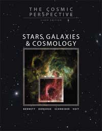
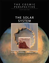
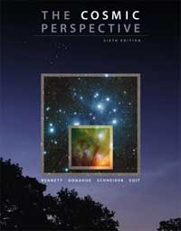
We did a series of Astronomy textbooks recently for Addison Wesley which meant we were actually paid to spend hours cruising the wonderful NASA image bank looking for great photos from Hubble to use on the covers. Randall particularly enjoyed this, since his walls are already decorated with nerdly photos from the Mars expeditions, one of which he used on a cover. Clients love using NASA space photos on covers, even if the connection to the book itself is a little tenuous, because they're free, like most government images; free in the sense that your tax dollars have already paid for them. You can directly download a high-resolution image as often as you like. In our many hours of happily surfing the cosmos, we preferred the European Space Agency's web site to the NASA site. Both agencies offer many of the same photos, since they jointly operate the Hubble Telescope and the Cassini-Huygens probe, but the ESA site is very logically laid out and easy to search. Here's the NASA image site, Hubble's own site, and the ESA gallery. Have fun!
Some great books by our friends
—by Naomi Schiff : July 14, 2009, 10:36am
Our talented and wonderful friends have been churning out some wonderful books:
Ric Rocamora
Filipino World War II Soldiers:
America’s Second-Class Veterans
(http://filvetsbookproject.blogspot.com/)
Touching portraits and narrative by Ric, a fine local photographer whose work embodies his conscience. You have probably seen some of his photos in Bay Area newspapers and magazines. This book is the culmination of years of involvement with these aging vets.
Barbara Graham
Eye of My Heart
(http://barbaragrahamonline.com/index.htm)
Barbara put together (and contributed a lovely piece to) this anthology by writers who are also grandmothers, considering the experience, and describing their new and evolving relationships with children and grandchildren. It's not your doilies-on-stuffed furniture sort of thing!
Charlie Haas
The Enthusiast
(http://www.harpercollins.com/book/index.aspx?isbn=9780061711824)
Charlie's novel follows its protagonist through stints at every kind of niche magazine and witnesses his amazing collection of friends, acquaintances and oddball employers. In the end: a life (and an acknowledgment of DeLauer’s Books’ important role for all us periodical browsers).
"From Your Window"
—by Naomi Schiff : May 12, 2009, 10:36am
Blogger Andrew Sullivan has been running a series of photographs "From Your Window" and asked readers to vote for a favorite for a cover photo for his upcoming book (http://andrewsullivan.theatlantic.com/the_daily_dish/2009/05/photo-book-feedback.html). Naomi commented and was rewarded by being (anonymously) quoted on the Sullivan blog:
From the blog:
In addition to 8,000 votes and counting, we have gotten some great feedback in the comments section of our book cover poll. A sample of the various input - the kind of editing most mainstream publishing companies don't provide any more (they're too busy generating buzz):
"I'm a book designer. New Orleans, hands down. Good color, quirky, will help sell the book. Liked Wisconsin too, but Ft. Lauderdale is the best candidate for the back cover! It's a great, if seedy, image. Pebble Beach: too pretty."
Naomi emailed the quote to Randall, and received this response:
That's you!? That's so funny. When I saw that a book designer commented, I clicked on the linked images. I hadn't been following the cover design poll, but your entry interested me.
See, you fascinate me even when you're anonymous.
A design challenge at turning 40
—by Naomi Schiff : April 3, 2009, 2:20pm
We've loved worked with Teri Lee at the Statewide MESA (Math, Engineering, Science Achievement) program for many years. Now, quick before we churn out another newsletter, we are working with Teri and newsletter chief Danielle McNamara, trying to figure out how best to add a 40th anniversary look to the logo we designed for them a few years ago. Here's the logo:

In a cheerful meeting we discussed (among other things) whether folks write -- and think about -- the number 4 as having an open or a closed top.

Go Fly a Kite (and hang a camera from it)
—by Randall Goodall : April 2, 2009, 10:46am
We've been designing and producing the regular magazine for the California Coastal Conservancy, California Coast & Ocean, for, well, decades and they're one of our favorite clients, especially the editor, Rasa Gustaitis. (Go subscribe; these people are really doing good work; some wonderful writing and photography.) But there's a funny design problem that comes from doing a magazine about the ocean, which is that most of your covers turn out to be blue. Even when you're fervently looking for photos that aren't blue, just for a change, it's hard not to end up with sky or fog or something that's pretty blue-ish. But not this month! There's a photographer, a professor of architecture at Cal named Cris Benton, who likes to put a camera on a kite and walk around the Bay Area taking photographs from 60 feet and up. This makes for unusual photographs because most aerial photography is from much higher (airplanes) and photos taken from
the tops of tall buildings are mostly urban. So kite photographers (and there are several of them; see Cris's webpage on KAP) can get detailed photos from above of outdoor landscapes. Cris likes to walk around the South Bay's salt ponds and this landscape is both Coastal and very much Not Blue. Here's the cover for this issue:
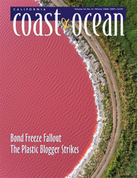
This is true color; that "water" is bright orange-pink, a high-salinity pond. It's actually one of the less-surreal photos Cris has taken of the salt ponds; see a beautiful gallery here. The downside of Kite Aerial Photography: so far Cris has lost two cameras.
Anna Richards Brewster in Fresno
—by Randall Goodall : March 27, 2009, 2:38pm
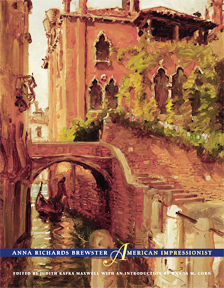 We did a museum catalog for a exhibition of paintings by Anna Richards Brewster, an interesting show conceived by Susan McClatchy and wonderfully curated by Dr. Judith Kafka Maxwell, at the Fresno Met until June. Naomi and I drove down to Fresno for the opening and a lavish dinner; we had a great time. Go see the show, buy the catalog (published by UC Press), or at least look at the website. But two unexpectedly cool things about Fresno: the Fresno Met is housed in the renovated home of the Fresno Bee, a lovely old palazzo that doesn't look like much else in Fresno, dominating its intersection of parking lots. Great use of an old newspaper building, which we particularly appreciated, since our studio is also in a converted old newspaper building, the Oakland Tribune Press Building. It made me wonder about the future urban landscape, as the newspaper industry fades away, what use people will put these emptied buildings, built to be large and impressive. (A similar question is what to do about dead malls.)
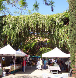 The other cool thing about Fresno was the Farmer's Market at the Vineyard, an amazingly huge bower of grapevines and roses, designed by the Berkeley architect Christopher Alexander. Really a beautiful space, filled with nice people selling some fantastic food. Alice Waters called this bower "a cathedral to fresh fruits and vegetables." We bought lots and drove back to Oakland.
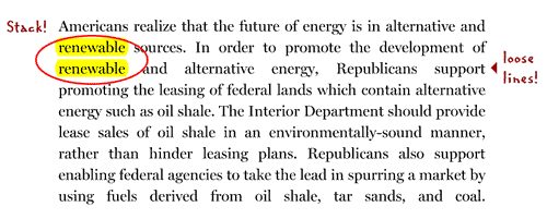
You can tell a lot about a budget by its cover
—by Naomi Schiff : March 27, 2009, 10:41am
Road to Recovery, the Republican budget piece that came out Thursday, suffers from abysmal production values.
It has engendered a certain amount of hilarity on account of its infantile flowcharts, untouched by a competent neighborhood graphic designer.
Well, okay, the Congressional Republicans aren't among our lucky clients. But there was another odd aspect:
Immediately noticeable on TV was the slapdash appearance of the document waved about at the podium: untrimmed, hand-assembled, printed on 11 x 17 format laser printer, with .25 inch minimum margin around the edge, bound with a staple in the middle after inexpert folding, the document bulging rather than flat. This was a rush job, probably done by in-house office staff. It was not up to Kinko's standards, certainly hadn't been touched by any self-respecting printer. The conscious or subliminal perception of sloppiness must have exacerbated the aura of disappointment at the press conference.
It seems strange, and of a piece with the hilariously amateur flow chart. The composition quality is pretty amazing too: